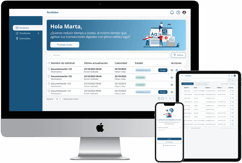
Enterprise E-Signature Platform Redesign
Decoding User Frustration
The original product was a technically powerful tool for document authentication that suffered from a high «entry barrier.» Users found the platform intimidating, and high abandonment rates were plaguing the conversion funnel. As the Sole Designer, my mission was to dismantle the technical complexity and rebuild the experience from the ground up, starting with a deep dive into the «Why» behind user failure.
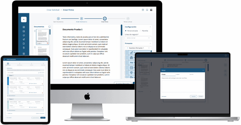
My Role: Lead Researcher & Sole Designer
I took full ownership of the end-to-end process, but for this project, I acted as a UX Researcher first. I designed and executed a comprehensive research plan to bridge the gap between business requirements and the diverse needs of our users, ensuring that every design decision made later in the process was backed by qualitative and quantitative data.
The Discovery Phase: Mapping the Friction
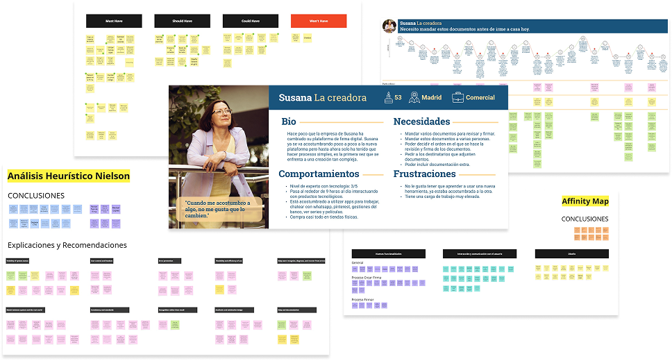
To move beyond assumptions, I conducted a rigorous research sprint:
Empathy Mapping & User Personas: I identified a critical generational divide between «The Creators» (older, legacy-system users) and «The Signers» (high-speed mobile users).
Customer Journey Mapping (CJM): I mapped the entire signing lifecycle, which revealed that «The Creators» were using manual workarounds outside the platform because they didn’t now they could do it within app’s internal workflow.
Clustering & Affinity Mapping: After conducting stakeholder and user interviews, I synthesized the data to identify the «Missing Scroll» as the primary technical killer of the experience.
MoSCoW Prioritization: With limited dev resources, I used the MoSCoW method to negotiate which features were «Must-Haves» (like the floating navigation bar and drag-and-drop chips) to ensure we delivered the highest impact with the least technical risk.
Process: Iterative Validation (From Lo-Fi to Hi-Fi)
I adopted a «Test Early, Fail Fast» approach to ensure the final product was bulletproof:
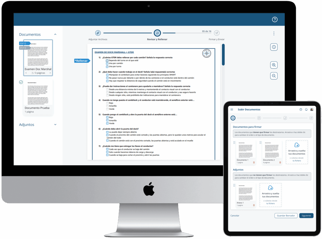
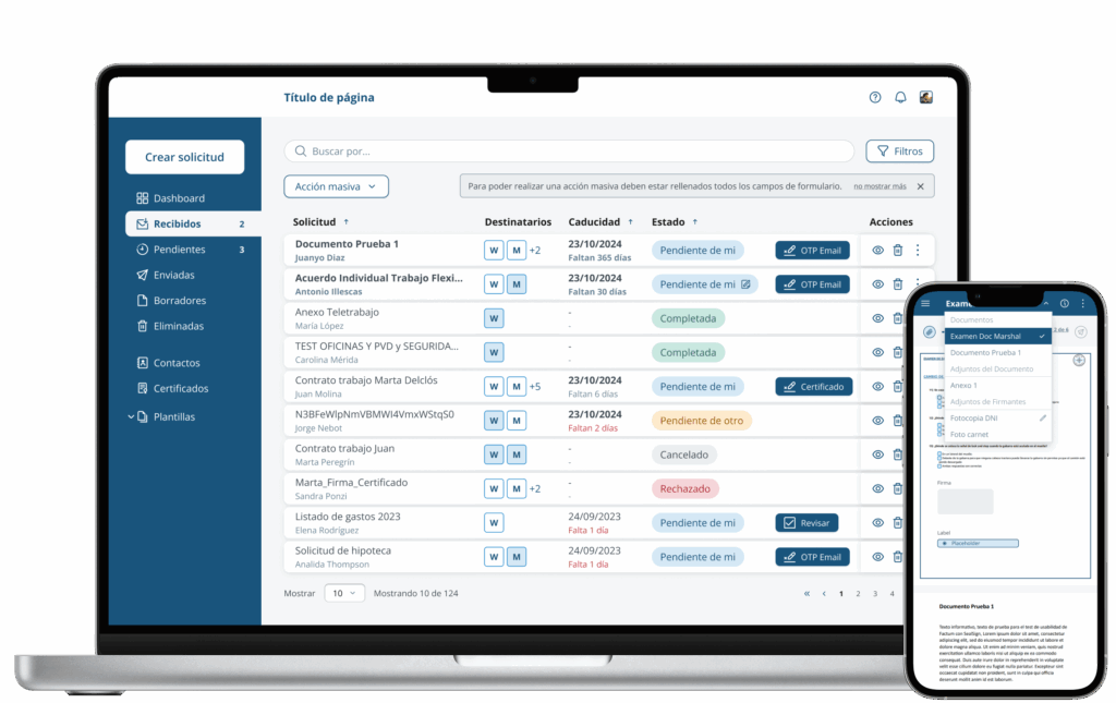
Lo-Fi Wireframing & Testing: Before a single pixel was polished, I tested low-fidelity wireframes to validate the navigation logic. This is where the «Floating Bar» concept was born—it was the only solution that successfully guided users through multi-page documents without a native scroll.
Hi-Fi Prototyping & Final Validation: Once the logic was sound, I built high-fidelity prototypes to test the «Drag-and-Drop» signature placement. Testing showed that this familiar mental model reduced document preparation time significantly for the «Creator» profile.
Ecosystem Expansion (The Mobile Offline Extension)
The Trigger: Data-Driven Ingestion
While the responsive web app successfully humanized the document preparation process for desktop and mobile-web creators, a big issue surfaced through customer support data. Our engineering team flagged a high volume of user tickets from on-site field workers (e.g., logistics coordinators and construction site supervisors) asking for a way to sign critical documents in environments with no internet connection.
The Strategy: Aggressive Feature Stripping
Instead of trying to replicate the heavy feature set of the core SaaS platform, I applied common-sense product logic to design a highly minimized, standalone mobile utility. Field workers under rugged on-site constraints did not need creation templates or workflow builders; they needed a distraction-free execution engine.
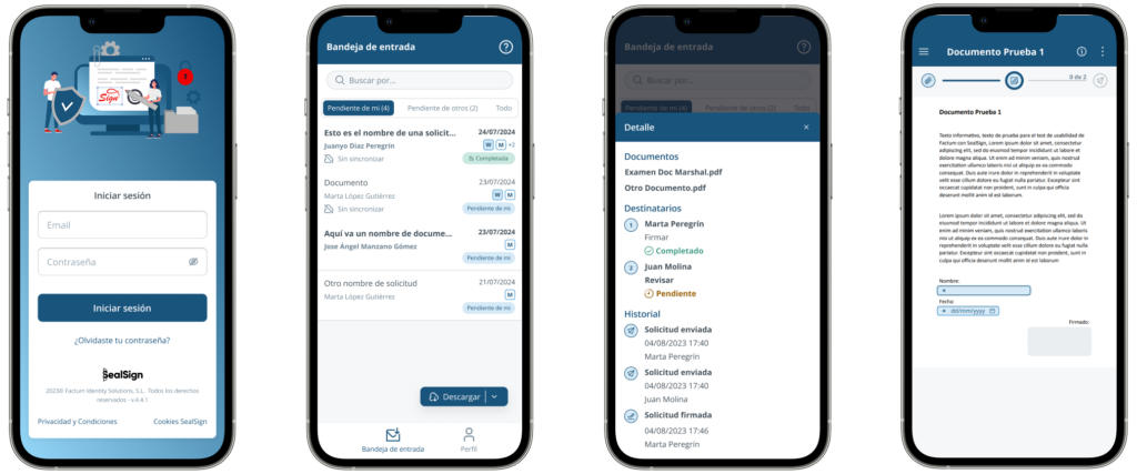
I designed a native mobile interface utilizing the existing brand design system, centering the entire experience around a simplified Document Inbox broken down by action type:
Immediate Action: An inbox clearly categorized by sorting tabs, identifying what is «Pending my signature» (Pendientes de mi) versus what is «Pending other people’s signatures» (Pendientes de otros).
Contextual Mobile Gestures: I introduced mobile-first interaction patterns. A standard click on a list item immediately opens the document viewer to trigger the secure signing flow, while a long-push gesture triggers a bottom sheet modal displaying quick-glance at the document details without forcing the user to leave their current inbox view.
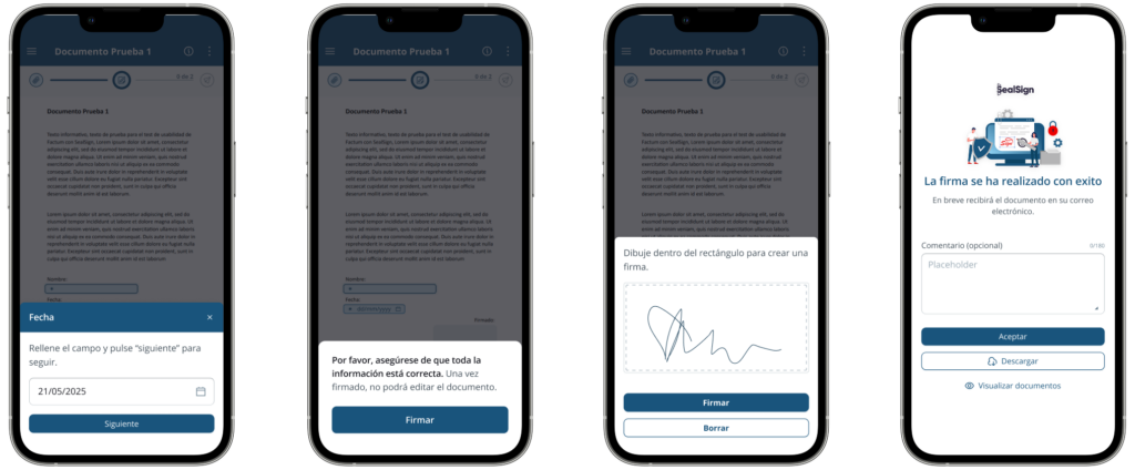
Asynchronous Trust & States: To establish confidence during offline use, the UI relies on clear feedback states. It captures signature intents locally on the device storage and queues them for background synchronization as soon as an internet connection is restored.
Impact: Data-Driven Success
By putting research at the forefront, I didn’t just redesign an app; I optimized a business process.
-
Removed the «Support Burden»: The new, intuitive navigation drastically reduced support tickets related to «document completion.»
-
Increased User Trust: By modernising and aligning the UI with industry standards (familiar drag-and-drop logic), we gave users more security, leading to higher adoption rates among corporate clients.
-
Strategic Alignment: My research artifacts established a shared source of truth. This allowed me to pivot the conversation away from technical assumptions and align stakeholders and developers around validated user needs.